You are using an out of date browser. It may not display this or other websites correctly.
You should upgrade or use an alternative browser.
You should upgrade or use an alternative browser.
New Uniforms On The Way??????
- Thread starter CA7
- Start date
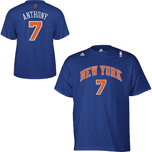
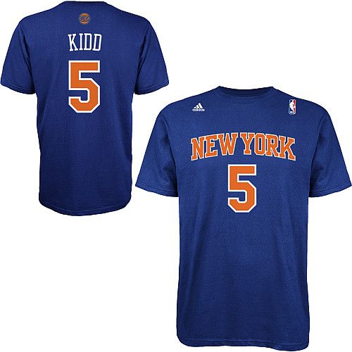
Do you see the difference between these 2 shirts
good observation...
Looks like the Knicks might have a retro look. Kind of like the 90's knicks logo but just remodeled?
Lettering and color is clearly different but I can't see the emblem on top of the Kidd shirt.
BillyHoyle
Benchwarmer
Do you see the difference between these 2 shirts
Only one of them has a DUI?
CA7
Scoring Champ
good observation...
Looks like the Knicks might have a retro look. Kind of like the 90's knicks logo but just remodeled?
Lettering and color is clearly different but I can't see the emblem on top of the Kidd shirt.
the Kidd logo is this one, which matches our new center court logo
Sprewell-Houston
Starter
the Kidd logo is this one, which matches our new center court logo
The old logo looked much better with the NYK in it.
NYk_Reloaded718
★KNICKS-TAPE★
Bad eye vision in the near future =p
dasilva1079
Benchwarmer
Man, talk about ****ty, do they ever have some kind of fan feedback before making these retarded decisions???
MeloforMayor
BALL DON'T LIE
The old logo looked much better with the NYK in it.
Yep. The NYK logo looks wayyy tougher with the hints of black. The new one looks soft as ****.
STAT1
Starter
Yep. The NYK logo looks wayyy tougher with the hints of black. The new one looks soft as ****.
The NYK logo was awesome, but probably outdated as it was meant to emulate the old subway coin tokens we used to have in NYC. Everyone uses metrocard now. Still it was old school & looked great. I would have preferred to keep it myself.
metrocard
Legend
Bad eye vision in the near future =p
Hahaha.
I don't know who designed this logo, but you guys are 100% on point.
Why can't the fans have a say on this?
I want these uniforms back, to me they were the best we ever had:
www40.tok2.com/home/mwg/knicksl1.jpg
KnickolasMGL
Benchwarmer
wtf is this?
CBS logo like one eye open?
SMH
CBS logo like one eye open?
SMH
NYk_Reloaded718
★KNICKS-TAPE★
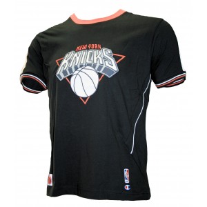
I like this jersey
Not Flashy, but classy
Last edited:
NYk_Reloaded718
★KNICKS-TAPE★
Hahaha.
I don't know who designed this logo, but you guys are 100% on point.
Why can't the fans have a say on this?
I want these uniforms back, to me they were the best we ever had:
www40.tok2.com/home/mwg/knicksl1.jpg
^^^ Those jerseys are beast too
Shaunyboy23
Benchwarmer
Is it just me, or would anyone else like to see us have sme kind of alternative jersey? Something in Orange or Black, I've always wanted to see that
MeloforMayor
BALL DON'T LIE
I like this jersey
Not Flashy, but classy
Word. I liked these too, from Melo's Garden debut. :smokin:
I actually believe that the Knicks are going to rock these jerseys next season, you know, to continue the trend of removing black from the logo.
Would olaso like to see an alternate jersey, too...