NYk_Reloaded718
★KNICKS-TAPE★
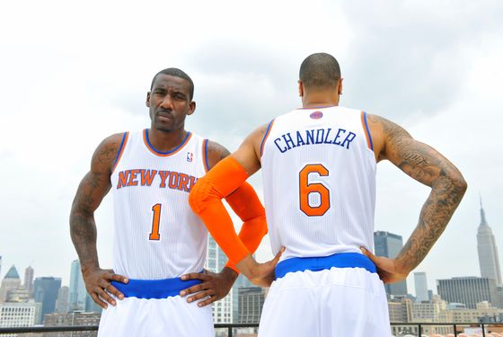
The new Jerseys are alright, i would of preferred to have kept the same Curve New York Letters on the front of the Jersey instead of these smallish straight New York Letters.
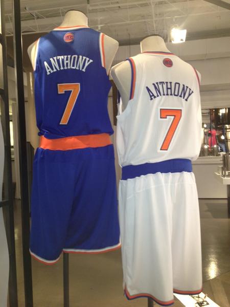
Honestly, i'm dissapointed. The thinner numbers with the extra borders, the flatten New York, that plain blue line on the shorts.. just can't seem to find any identity. The road ones look less retarded though