You are using an out of date browser. It may not display this or other websites correctly.
You should upgrade or use an alternative browser.
You should upgrade or use an alternative browser.
New Uniforms On The Way??????
- Thread starter CA7
- Start date
orangeblobman
Rotation player
The new Bklyn Nets jerseys have to be the worst in the NBA.


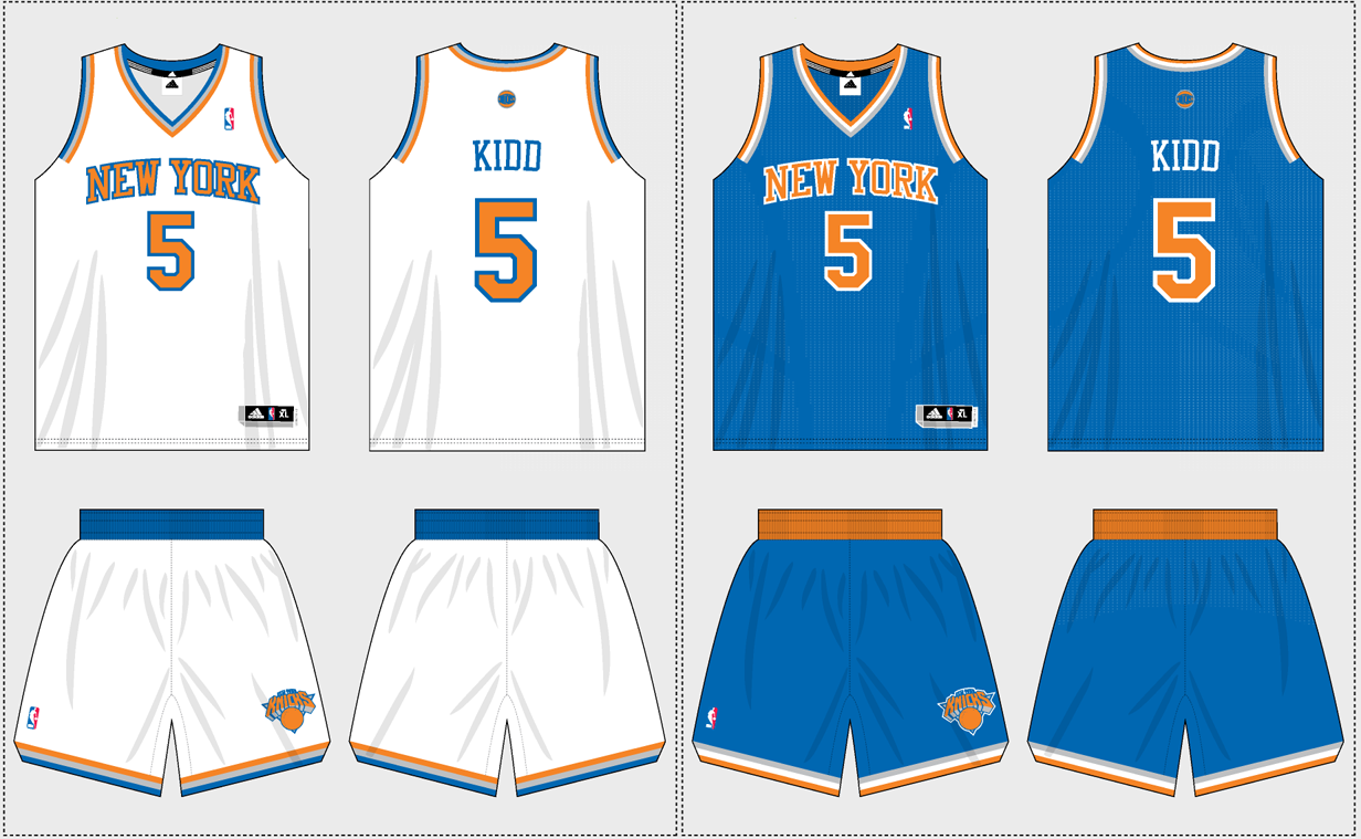
I'm not a fan of the V-cut pattern in the front, but I like the jerseys overall. It's a classic color combination and the numbers and letters don't try to do too much.
Helluva lot better than anything they had in Jersey.
At the same time, overall, their look feels like it's missing something. I love that it's clean-cut and direct, but it just needs maybe one little thing, I can't quite put my toes on it. Maybe a third color as an accent would do it.
I LOVE the straight line on the back, separating the name and number fields. That's a great look.


AmareForPresident
Starter

I agree with Metro we NEED to bring back the 1999 jerseys! It would be perfect timing now that we got Camby back.
I always wanted a black alternate Knicks jersey, this one looks sick!

MeloforMayor
BALL DON'T LIE
I agree with Metro we NEED to bring back the 1999 jerseys! It would be perfect timing now that we got Camby back.
I always wanted a black alternate Knicks jersey, this one looks sick!
I want the Knicks to wear those 99' jerseys in the 2013 Finals. :smokin:
DaTPRiNCE
The Knicks are Back
JaYnYcE
Benchwarmer
the Brooklynette's uni's look like hospital gowns, perfect for scrubs.
LOL
Sent from my iPhone using Tapatalk
CA7
Scoring Champ
MeloforMayor
BALL DON'T LIE

I think these look sick.
Real NY Baller
Starter
I'm not a fan of the V-cut pattern in the front, but I like the jerseys overall. It's a classic color combination and the numbers and letters don't try to do too much.
Helluva lot better than anything they had in Jersey.
At the same time, overall, their look feels like it's missing something. I love that it's clean-cut and direct, but it just needs maybe one little thing, I can't quite put my toes on it. Maybe a third color as an accent would do it.
I LOVE the straight line on the back, separating the name and number fields. That's a great look.
I actually like the black one, the white one looks a bit bland, imo. I think their home court looks nice too.
liquid347
Rookie
New uniforms in 2k13

 http://www.youtube.com/watch?v=sF1yR7Q75S4&list=UUGlHzR3R_0qV6FJlExyvtrQ&index=2&feature=plcp
at 1:04 and 1:21

at 1:04 and 1:21
orangeblobman
Rotation player
They should just bring a navy blue uniform.
p0nder
Starter
the blue seems lighter then the 2010/2011 jerseys and the lack of black really brightens it all up. It feels more old school. I can dig it. But i am looking forward to seeing the winter jerseys that the teams have this year. It may be the right time to pick up a Melo or tyson jersey depending on the scheme.